
If you want to build an email list, sell a product, or generate leads, a landing page is your most powerful tool.
When I first started digital marketing, I made the “rookie mistake” of sending paid traffic to my homepage. Visitors got distracted by the menu, clicked around, and left. A landing page fixes this by having exactly one job: getting the visitor to take one specific action.
This is especially important if you’re promoting affiliate offers, where sending traffic to a homepage usually kills conversions.
In this guide, we’ll define the anatomy of a perfect page and break down 5 real-world landing page examples you can model for your own business.
What is a Landing Page? (And Why You Need One)
A landing page is a standalone web page built for a single purpose: conversions. While a standard website is designed for exploration, a landing page is designed for results. Most high-performing pages offer a “Lead Magnet” in exchange for contact info, such as:
Once you collect that email, the real money comes from what you do next with your email marketing strategy.
Common Lead Magnet Types
- Free eBooks or PDF guides
- Webinar registrations
- Free trials or software demos
- Discount codes
Website vs. Landing Page: The Key Differences
| Feature | Regular Website | Landing Page |
| Goal | General Information | Single Conversion |
| Navigation | Full Menu (Home, About, etc.) | Minimal or No Menu |
| Content | Diverse / Multiple Topics | Focused on One Offer |
| Links | Many (Social, Blog, Sidebar) | One (The CTA Button) |
Landing pages are a core tool for many online income strategies, not just product sales.
8 Elements of a High-Converting Landing Page
Before we look at the examples, ensure your page has these essential building blocks:
- Headline: A clear, benefit-driven promise.
- Subheadline: Supporting context that builds interest.
- Compelling Copy: Address the reader’s pain point and offer your solution.
- Visuals: Professional images or videos that demonstrate the offer.
- Social Proof: Testimonials, reviews, or “Trusted By” logos.
- Call-to-Action (CTA): A bold button that tells the user exactly what to do.
- Simple Form: Only ask for necessary info (Name + Email is best).
- No Distractions: Remove the header and footer navigation to keep users on the page.
5 Landing Page Examples to Inspire Your Next Design
1. Netflix (The Minimalist Approach)
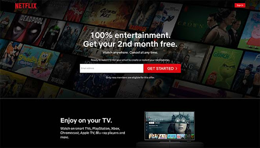
Netflix is the king of reducing “choice paralysis.” Their landing page is incredibly simple because everyone knows what Netflix is—they just need to be convinced it’s easy to start.
- The Lesson: Use a “Low-Risk” hook. Netflix uses “Cancel anytime” to remove the fear of commitment.
2. Constant Contact (The Industry-Specific Offer)
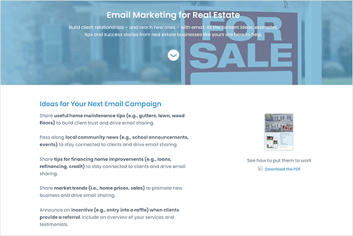
This page targets real estate pros with a specific PDF guide. By narrowing the audience, the conversion rate sky-rockets.
- The Lesson: Specificity wins. A “Guide for Real Estate” converts better than a “Guide for Business.”
3. OptinMonster (The Feature-to-Benefit Sales Page)
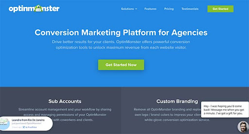
OptinMonster uses a long-form landing page that hits every psychological trigger.
- The Lesson: Use visuals to show the product in action. If people can see how it works, they are more likely to buy.
4. Airbnb (The “Step-by-Step” Signup)
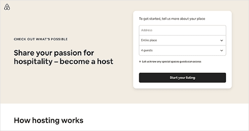
Airbnb makes becoming a host feel achievable. They hide optional fields so the user doesn’t feel overwhelmed by a giant form.
- The Lesson: Use Progressive Disclosure. Start with a short form and ask for more details on the next page.
5. Taboola (The Data-Driven Lead Magnet)
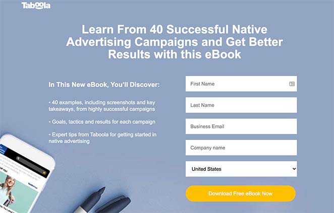
Taboola uses a case study/ebook to attract B2B leads. They use hard numbers and stats to build immediate authority.
- The Lesson: Numbers create trust. If you have “10,000+ happy customers” or “A 45% increase in ROI,” put it in the headline.
Final Tip: Model, Don’t Just Copy
The fastest way to success isn’t guessing; it’s modeling what already works for major brands. Look at the structure of these examples: Headline -> Benefit -> Proof -> CTA.
Apply that same structure to your own offer, and you will see your conversion rates climb.
Of course, a page only converts if people see it, so learning how to increase blog traffic matters just as much.
Ready to Turn Traffic Into Leads?
A landing page is just the middle of the system.
Traffic brings visitors. Landing pages capture emails. Email marketing builds trust. Offers generate income.
If you don’t have all three working together, conversions stay low.
If you want a simple, beginner-friendly way to build landing pages and automated follow-ups:
[Click Here to Start for FREE with LeadsLeap]
I love to shares practical tips, tools, and resources to help make building income online simpler and more approachable. Through this website, you get helpful content and recommendations, including the Plug-In Profit Site, a system designed to help beginners get started online with a website, step-by-step training, and built-in income streams. Learn more about getting started with Plug-In Profit Site here.